Google Mobile-Friendly Test
Visit Google Mobile-Friendly Test
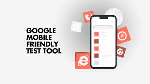
Google's Mobile-Friendly Test is a professional tool designed to evaluate the mobile-friendliness of websites. It caters to a neutral audience, offering insights and recommendations to improve the user experience on mobile devices.
Using the tool is straightforward: users simply enter their website URL, and the Mobile-Friendly Test analyzes the site's mobile compatibility. It checks various factors such as responsive design, viewport configuration, font size, and button size to determine if the site meets Google's mobile-friendly criteria.
The test generates a detailed report highlighting any issues that may affect the mobile experience, along with recommendations for improvement. This includes suggestions for optimizing page layout, improving loading speed, and enhancing usability on smaller screens.
One of the key benefits of using Google's Mobile-Friendly Test is its reliability and authority. Since it's developed by Google, the test aligns with the search engine's mobile-friendly guidelines, giving users confidence in the accuracy of the results.
For website owners and developers, ensuring mobile-friendliness is essential for attracting and retaining mobile users, as well as for maintaining search engine visibility. By utilizing Google's Mobile-Friendly Test, they can identify and address any issues that may hinder their site's performance on mobile devices, ultimately leading to a better user experience and improved search rankings.
Google Mobile-Friendly Test Highlights
- Evaluates mobile-friendliness of websites. - Checks responsive design and viewport configuration. - Analyzes font size and button size for usability. - Generates detailed reports with recommendations. - Developed by Google, aligns with its guidelines. - Helps improve user experience on mobile devices. - Essential for attracting and retaining mobile users. - Optimizes sites for better search engine visibility.
Visit Google Mobile-Friendly Test


 Login with LinkedIn
 Login with Google
 Login with Facebook